Chapter 8 R语言ggplot2热图
8.1 pheatmap热图
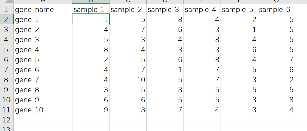
R语言里做热图最快捷的方式是用pheatmap这个R包,优点是用非常少的代码就可以出一个比较好看的图,缺点是细节修改不是很方便,比如要用热图展示基因表达量的数据,准备数据的格式如下
pheatmap不是R语言自带的R包,第一次使用需要先安装,安装直接使用命令install.packages("pheatmap")
读取数据
library(readxl)
dat01<-read_excel("example_data/06-lineplot/dat08.xlsx")
这里需要注意的 一个点是热图数据通常需要把第一列的基因名作为整个数据的行名,但是读取excel的函数好像没有指定列为行名的函数,当然可以将数据集读取进来以后再进行转换,另外一种方式就是把数据另存为csv格式,然后用读取csv格式数据的函数
这里需要注意的一点是转换为csv格式的时候选择如下截图中的2,不要选择1

读取csv格式数据
dat01<-read.delim(file = "example_data/08-heatmap/01pheatmap_example.csv",
                  header=TRUE,
                  sep=",",
                  row.names = 1)
作图代码
dat01<-read.delim(file = "example_data/08-heatmap/01pheatmap_example.csv",
                  header=TRUE,
                  sep=",",
                  row.names = 1)
library(pheatmap)
pheatmap(dat01)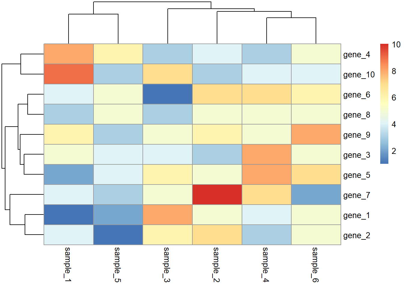
如果要在色块上添加文本,再单独准备一个和热图数据格式一样的数据,然后用display_numbers参数添加文本,这里我就直接使用热图的数据
dat01<-read.delim(file = "example_data/08-heatmap/01pheatmap_example.csv",
                  header=TRUE,
                  sep=",",
                  row.names = 1)
library(pheatmap)
pheatmap(dat01)
pheatmap(dat01,
         display_numbers = dat01)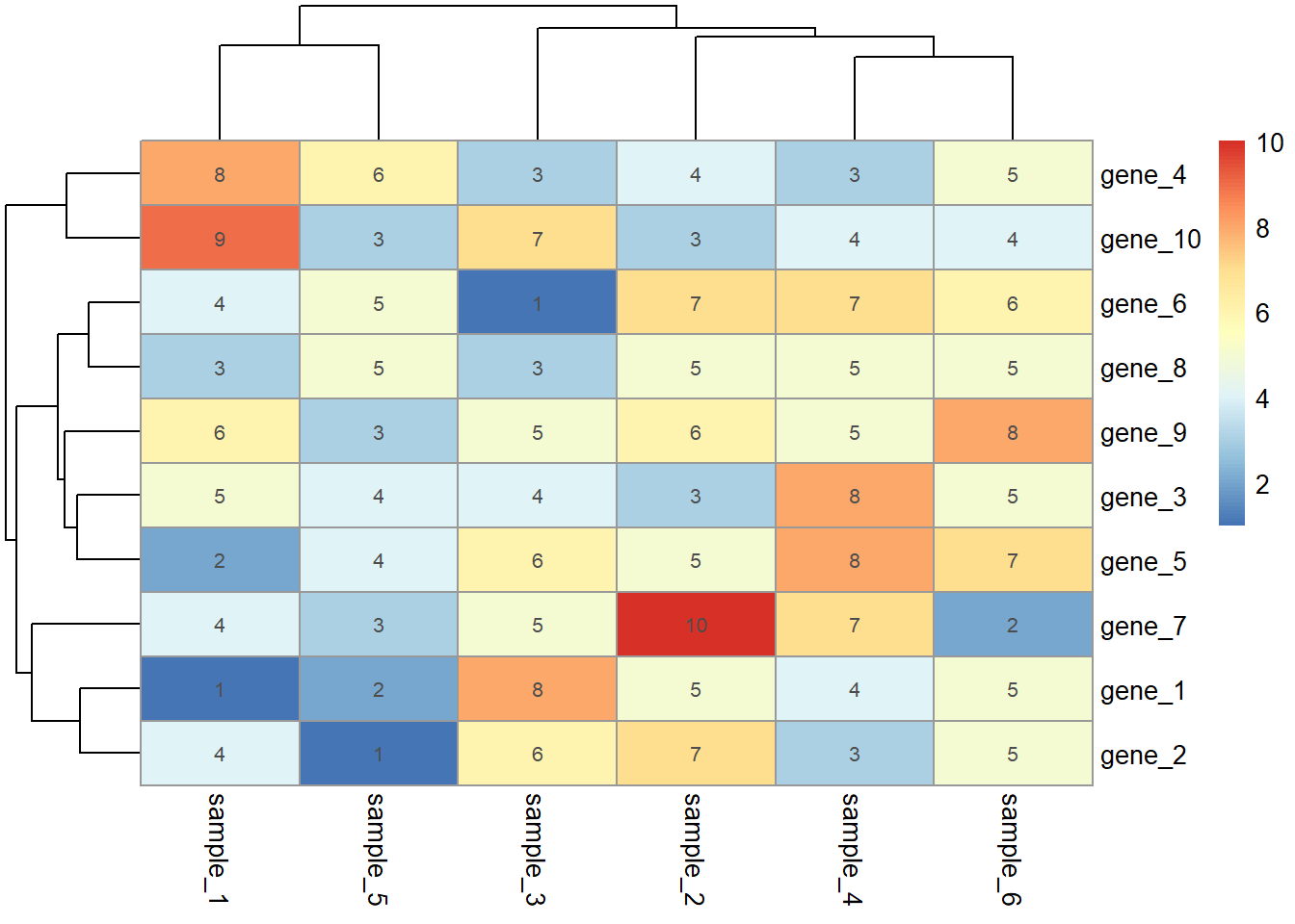
以上是对pheatmap这个R包的简要介绍
ggplot2也有直接做热图的函数 geom_tile(),ggplot2做热图可能代码稍微繁琐,但是优点是细节调整方便,基本上所有的细节都可以用代码来调整
ggplot2做热图还需要掌握的一个知识点是 长格式数据 和 宽格式 数据,ggplot2作图的输入数据都是长格式数据,长格式数据如下,一列x,一列y,还有一个数据
宽格式数据截图如下
这个长宽格式转化是ggplot2作图必须理解的一个概念
R语言里提供了长宽格式数据互相转化的函数,这里我以tidyverse这个R包里的函数作为介绍,tidyverse主要是用来在数据处理的,也不是R语言自带的R包,需要运行安装命令install.packages("tidyverse")
宽格式数据转换为长格式用到的函数是pivot_longer()
转换代码
library(readxl)
dat01<-read_excel("example_data/08-heatmap/02_wide_data.xlsx")
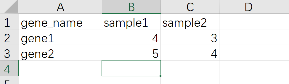
head(dat01)## # A tibble: 2 x 3
## gene_name sample1 sample2
## <chr> <dbl> <dbl>
## 1 gene1 4 3
## 2 gene2 5 4library(tidyverse)
dat01 %>%
pivot_longer(-gene_name,names_to = "A",values_to = "B")## # A tibble: 4 x 3
## gene_name A B
## <chr> <chr> <dbl>
## 1 gene1 sample1 4
## 2 gene1 sample2 3
## 3 gene2 sample1 5
## 4 gene2 sample2 4长格式转换为宽格式的函数是pivot_wider()
转换代码
library(readxl)
dat01<-read_excel("example_data/08-heatmap/02_long_data.xlsx")
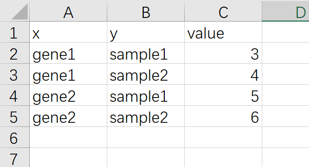
head(dat01)## # A tibble: 4 x 3
## x y value
## <chr> <chr> <dbl>
## 1 gene1 sample1 3
## 2 gene1 sample2 4
## 3 gene2 sample1 5
## 4 gene2 sample2 6library(tidyverse)
dat01 %>%
pivot_wider(names_from = y,values_from = value)## # A tibble: 2 x 3
## x sample1 sample2
## <chr> <dbl> <dbl>
## 1 gene1 3 4
## 2 gene2 5 6这个是最基本的长宽格式数据转换,如果数据集有很多列,有时候转换会相对比较复杂,这里就不做介绍,因为我也搞不懂有时候
8.2 ggplot2热图
以下介绍ggplot2做热图的代码都是假设已经拿到了长格式数据
示例数据如下
最基本的热图代码
library(readxl)
dat01<-read_excel("example_data/08-heatmap/03_heatmap_example.xlsx")
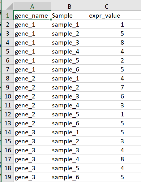
head(dat01)## # A tibble: 6 x 3
## gene_name Sample expr_value
## <chr> <chr> <dbl>
## 1 gene_1 sample_1 1
## 2 gene_1 sample_2 5
## 3 gene_1 sample_3 8
## 4 gene_1 sample_4 4
## 5 gene_1 sample_5 2
## 6 gene_1 sample_6 5library(ggplot2)
ggplot(data=dat01,aes(x=gene_name,y=Sample))+
geom_tile(aes(fill=expr_value),color="red")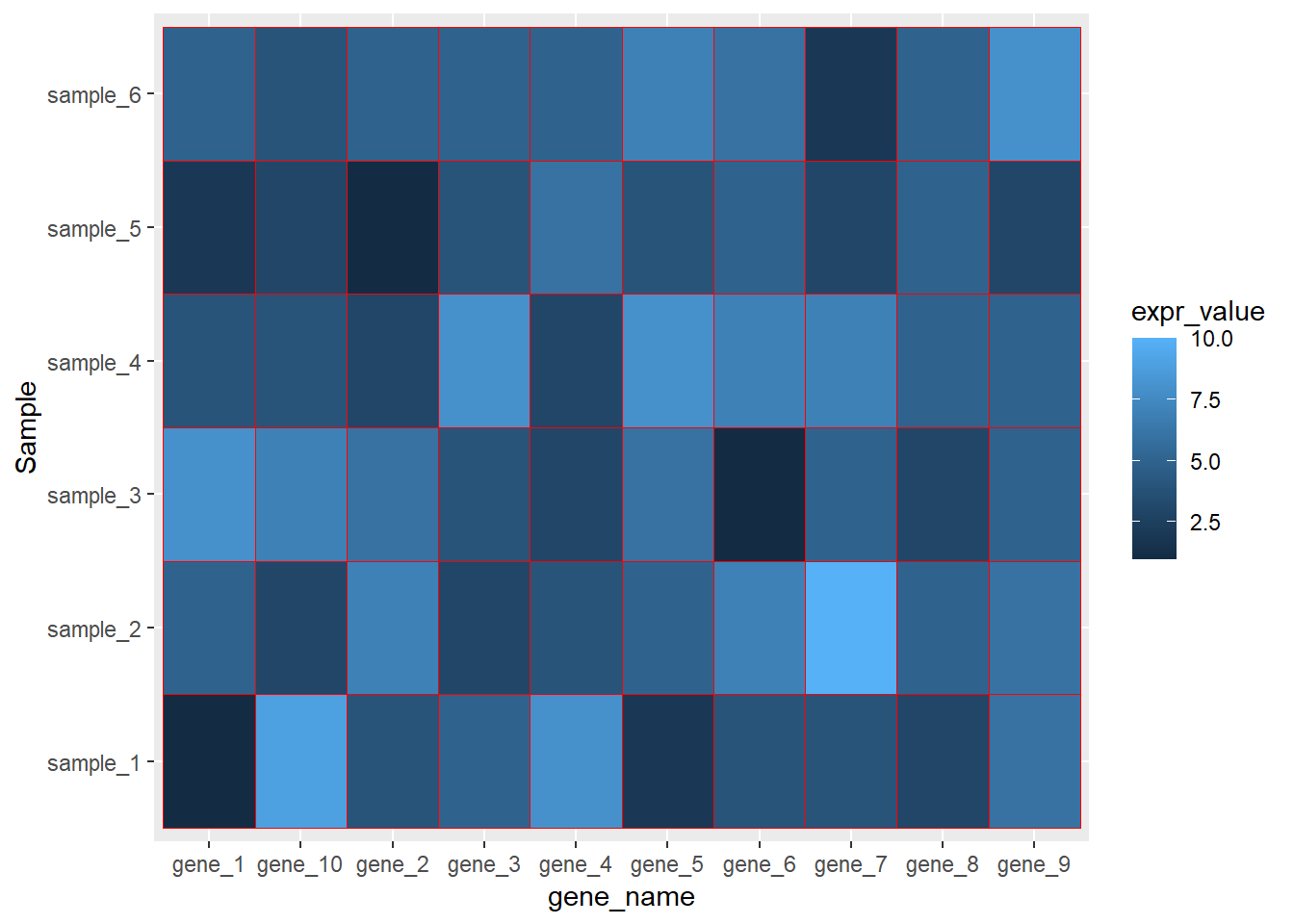
ggplot(data=dat01,aes(x=gene_name,y=Sample))+
geom_tile(aes(fill=expr_value),color=NA)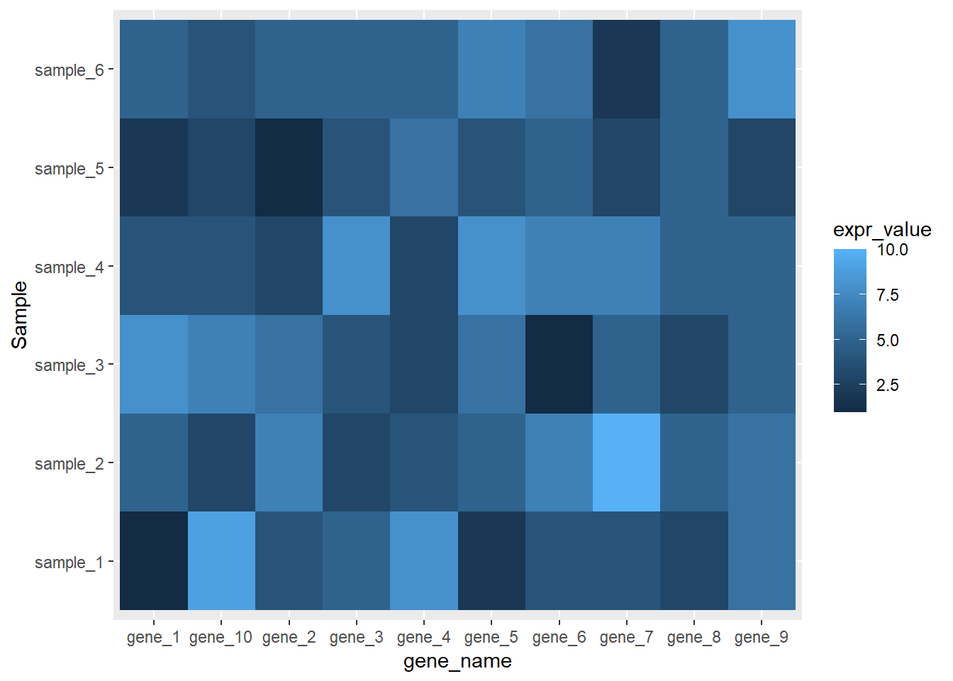
热图经常遇到的操作是调整坐标轴的顺序,这个可以通过赋予因子水平来实现
library(readxl)
dat01<-read_excel("example_data/08-heatmap/03_heatmap_example.xlsx")
head(dat01)## # A tibble: 6 x 3
## gene_name Sample expr_value
## <chr> <chr> <dbl>
## 1 gene_1 sample_1 1
## 2 gene_1 sample_2 5
## 3 gene_1 sample_3 8
## 4 gene_1 sample_4 4
## 5 gene_1 sample_5 2
## 6 gene_1 sample_6 5dat01$gene_name<-factor(dat01$gene_name,
levels = c("gene_1","gene_2","gene_3",
"gene_4","gene_5","gene_6",
"gene_7","gene_8","gene_9",
"gene_10"))
library(ggplot2)

ggplot(data=dat01,aes(x=gene_name,y=Sample))+
  geom_tile(aes(fill=expr_value),color="red")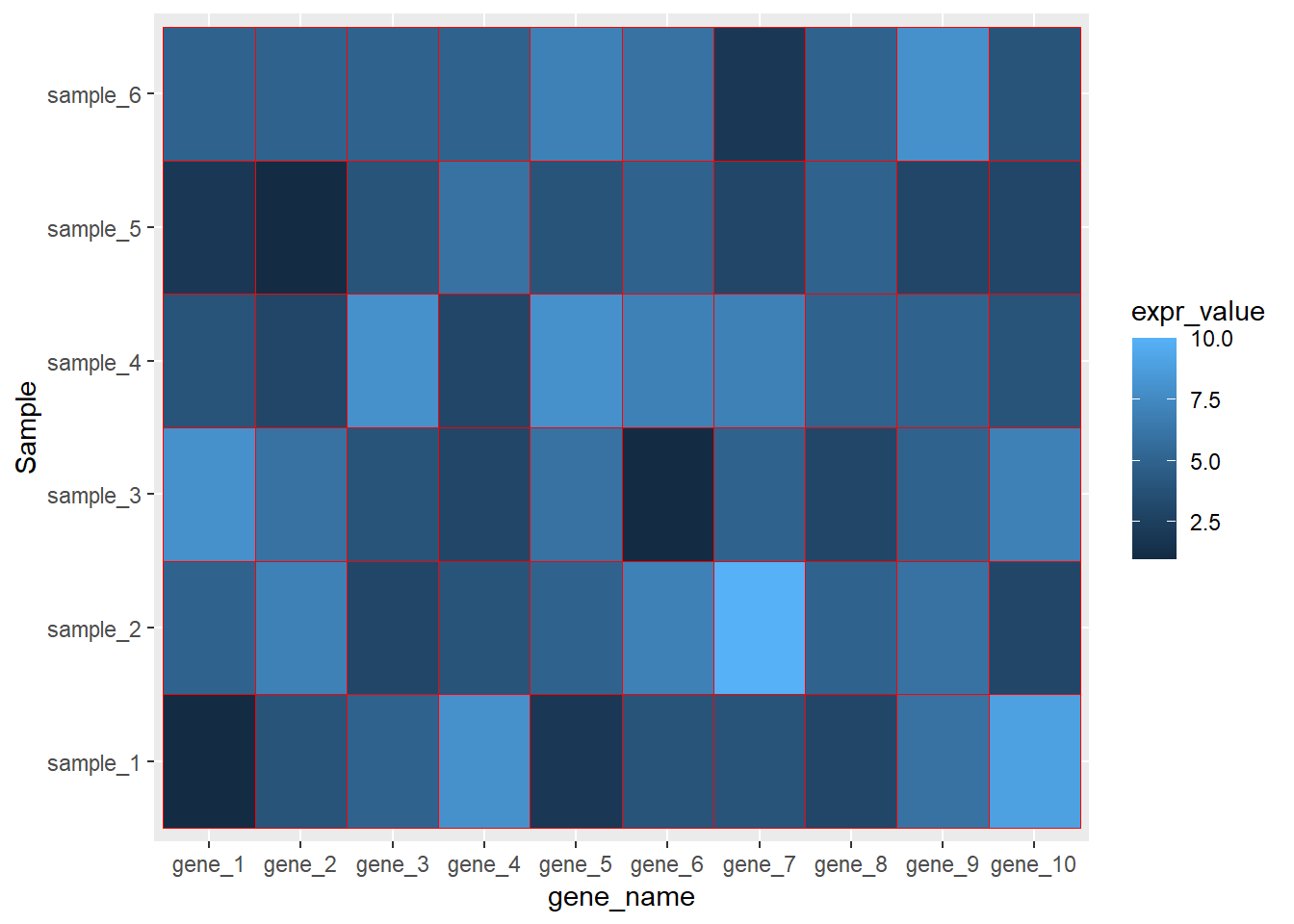
dat01$Sample<-factor(dat01$Sample,
levels = c("sample_2","sample_4","sample_6",
"sample_1","sample_3","sample_5"))
ggplot(data=dat01,aes(x=gene_name,y=Sample))+
geom_tile(aes(fill=expr_value),color="red")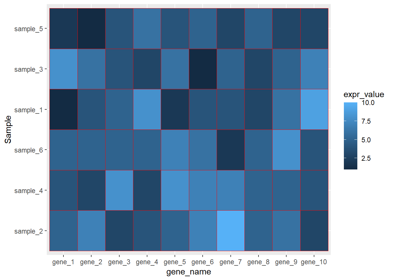
更改热图色块填充的颜色
更改热图填充颜色有很多种方式,这里我介绍我自己最常用的一种方式
参考链接
这里用到额外的一个R包 paletteer
https://github.com/EmilHvitfeldt/paletteer
library(readxl)
dat01<-read_excel("example_data/08-heatmap/03_heatmap_example.xlsx")
head(dat01)
## # A tibble: 6 x 3
## gene_name Sample expr_value
## <chr> <chr> <dbl>
## 1 gene_1 sample_1 1
## 2 gene_1 sample_2 5
## 3 gene_1 sample_3 8
## 4 gene_1 sample_4 4
## 5 gene_1 sample_5 2
## 6 gene_1 sample_6 5dat01$gene_name<-factor(dat01$gene_name,
levels = c("gene_1","gene_2","gene_3",
"gene_4","gene_5","gene_6",
"gene_7","gene_8","gene_9",
"gene_10"))
library(ggplot2)
ggplot(data=dat01,aes(x=gene_name,y=Sample))+
geom_tile(aes(fill=expr_value),color="red")
library(paletteer)## Warning: package 'paletteer' was built under R version 4.0.5ggplot(data=dat01,aes(x=gene_name,y=Sample))+
geom_tile(aes(fill=expr_value),color="red")+
scale_fill_paletteer_c("ggthemes::Classic Orange-White-Blue")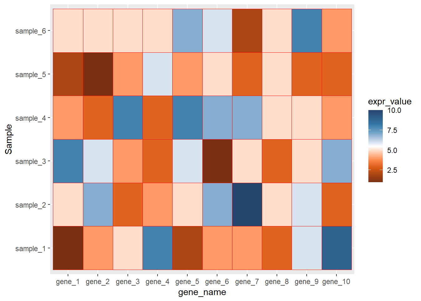
ggplot(data=dat01,aes(x=gene_name,y=Sample))+
geom_tile(aes(fill=expr_value),color="red")+
scale_fill_paletteer_c("ggthemes::Classic Orange-White-Blue",
direction = -1)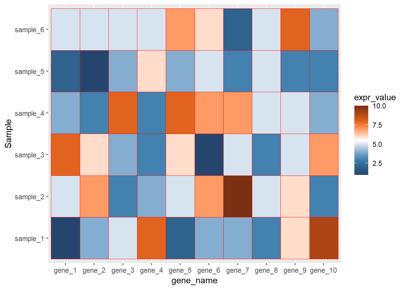
调整坐标轴文本标签的位置,y轴左右,x轴是上下
library(readxl)
dat01<-read_excel("example_data/08-heatmap/03_heatmap_example.xlsx")
head(dat01)
## # A tibble: 6 x 3
## gene_name Sample expr_value
## <chr> <chr> <dbl>
## 1 gene_1 sample_1 1
## 2 gene_1 sample_2 5
## 3 gene_1 sample_3 8
## 4 gene_1 sample_4 4
## 5 gene_1 sample_5 2
## 6 gene_1 sample_6 5dat01$gene_name<-factor(dat01$gene_name,
levels = c("gene_1","gene_2","gene_3",
"gene_4","gene_5","gene_6",
"gene_7","gene_8","gene_9",
"gene_10"))
library(ggplot2)
library(paletteer)
ggplot(data=dat01,aes(x=gene_name,y=Sample))+
  geom_tile(aes(fill=expr_value),color="red")+
  scale_fill_paletteer_c("ggthemes::Classic Orange-White-Blue",
direction = -1)+
scale_x_discrete(position = "top")+
scale_y_discrete(position = "right")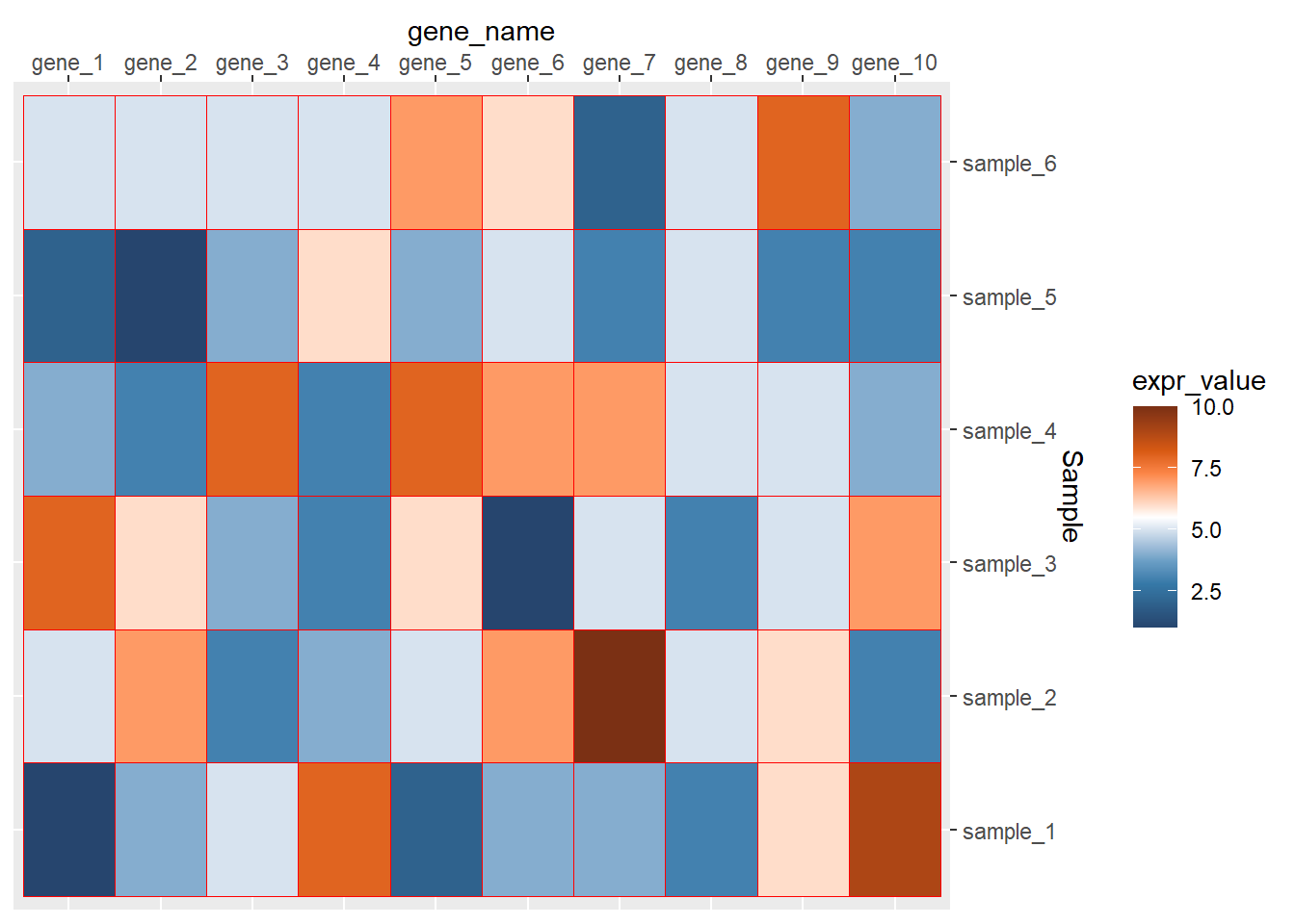
调整坐标轴的文本方向
library(readxl)
dat01<-read_excel("example_data/08-heatmap/03_heatmap_example.xlsx")
head(dat01)
## # A tibble: 6 x 3
## gene_name Sample expr_value
## <chr> <chr> <dbl>
## 1 gene_1 sample_1 1
## 2 gene_1 sample_2 5
## 3 gene_1 sample_3 8
## 4 gene_1 sample_4 4
## 5 gene_1 sample_5 2
## 6 gene_1 sample_6 5dat01$gene_name<-factor(dat01$gene_name,
levels = c("gene_1","gene_2","gene_3",
"gene_4","gene_5","gene_6",
"gene_7","gene_8","gene_9",
"gene_10"))
library(ggplot2)
library(paletteer)
ggplot(data=dat01,aes(x=gene_name,y=Sample))+
geom_tile(aes(fill=expr_value),color="red")+
scale_fill_paletteer_c("ggthemes::Classic Orange-White-Blue",
direction = -1)+
scale_x_discrete(position = "top")+
scale_y_discrete(position = "right")+
theme(axis.text.x = element_text(angle=60))
ggplot(data=dat01,aes(x=gene_name,y=Sample))+
geom_tile(aes(fill=expr_value),color="red")+
scale_fill_paletteer_c("ggthemes::Classic Orange-White-Blue",
direction = -1)+
scale_x_discrete(position = "top")+
scale_y_discrete(position = "right")+
theme(axis.text.x = element_text(angle=60,hjust=0,vjust=1)) 去掉整个的灰色背景和坐标轴的小短线
library(readxl)
dat01<-read_excel("example_data/08-heatmap/03_heatmap_example.xlsx")
head(dat01)
## # A tibble: 6 x 3
## gene_name Sample expr_value
## <chr> <chr> <dbl>
## 1 gene_1 sample_1 1
## 2 gene_1 sample_2 5
## 3 gene_1 sample_3 8
## 4 gene_1 sample_4 4
## 5 gene_1 sample_5 2
## 6 gene_1 sample_6 5dat01$gene_name<-factor(dat01$gene_name,
levels = c("gene_1","gene_2","gene_3",
"gene_4","gene_5","gene_6",
"gene_7","gene_8","gene_9",
"gene_10"))
library(ggplot2)
library(paletteer)
ggplot(data=dat01,aes(x=gene_name,y=Sample))+
geom_tile(aes(fill=expr_value),color="red")+
scale_fill_paletteer_c("ggthemes::Classic Orange-White-Blue",
direction = -1)+
scale_x_discrete(position = "top")+
scale_y_discrete(position = "right")+
theme(axis.text.x = element_text(angle=60,hjust=0,vjust=1),
axis.ticks = element_blank(),
panel.background = element_blank())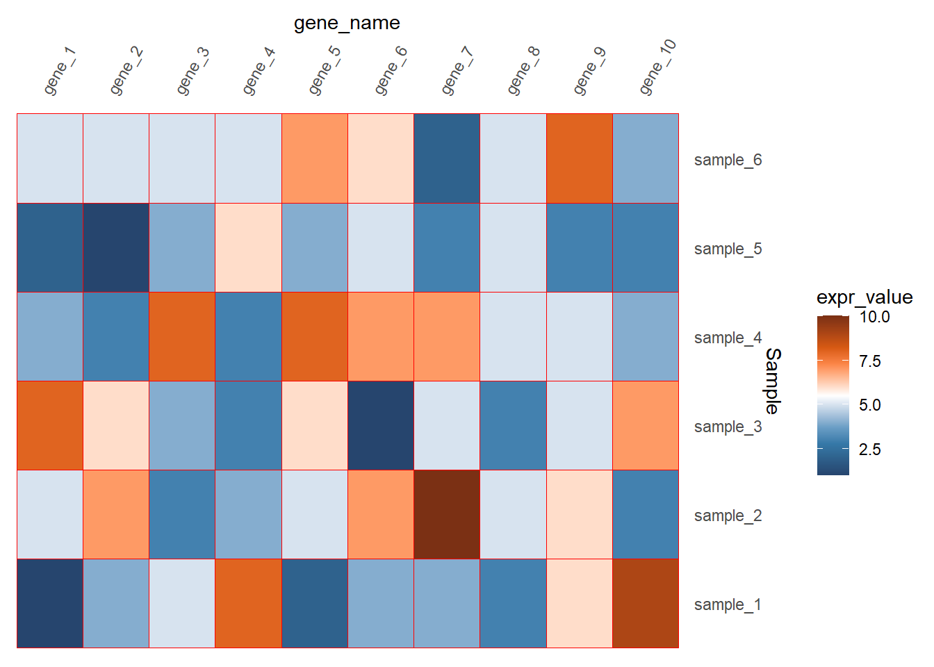
如果看起来坐标轴的文本距离图比较远的话还可以调整
library(readxl)
dat01<-read_excel("example_data/08-heatmap/03_heatmap_example.xlsx")
head(dat01)
## # A tibble: 6 x 3
## gene_name Sample expr_value
## <chr> <chr> <dbl>
## 1 gene_1 sample_1 1
## 2 gene_1 sample_2 5
## 3 gene_1 sample_3 8
## 4 gene_1 sample_4 4
## 5 gene_1 sample_5 2
## 6 gene_1 sample_6 5dat01$gene_name<-factor(dat01$gene_name,
levels = c("gene_1","gene_2","gene_3",
"gene_4","gene_5","gene_6",
"gene_7","gene_8","gene_9",
"gene_10"))
library(ggplot2)
library(paletteer)
ggplot(data=dat01,aes(x=gene_name,y=Sample))+
geom_tile(aes(fill=expr_value),color="red")+
scale_fill_paletteer_c("ggthemes::Classic Orange-White-Blue",
direction = -1)+
scale_x_discrete(position = "top",
expand = expansion(mult = c(0,0)))+
scale_y_discrete(position = "right",
expand = expansion(mult = c(0,0)))+
theme(axis.text.x = element_text(angle=60,hjust=0,vjust=1),
axis.ticks = element_blank(),
panel.background = element_blank())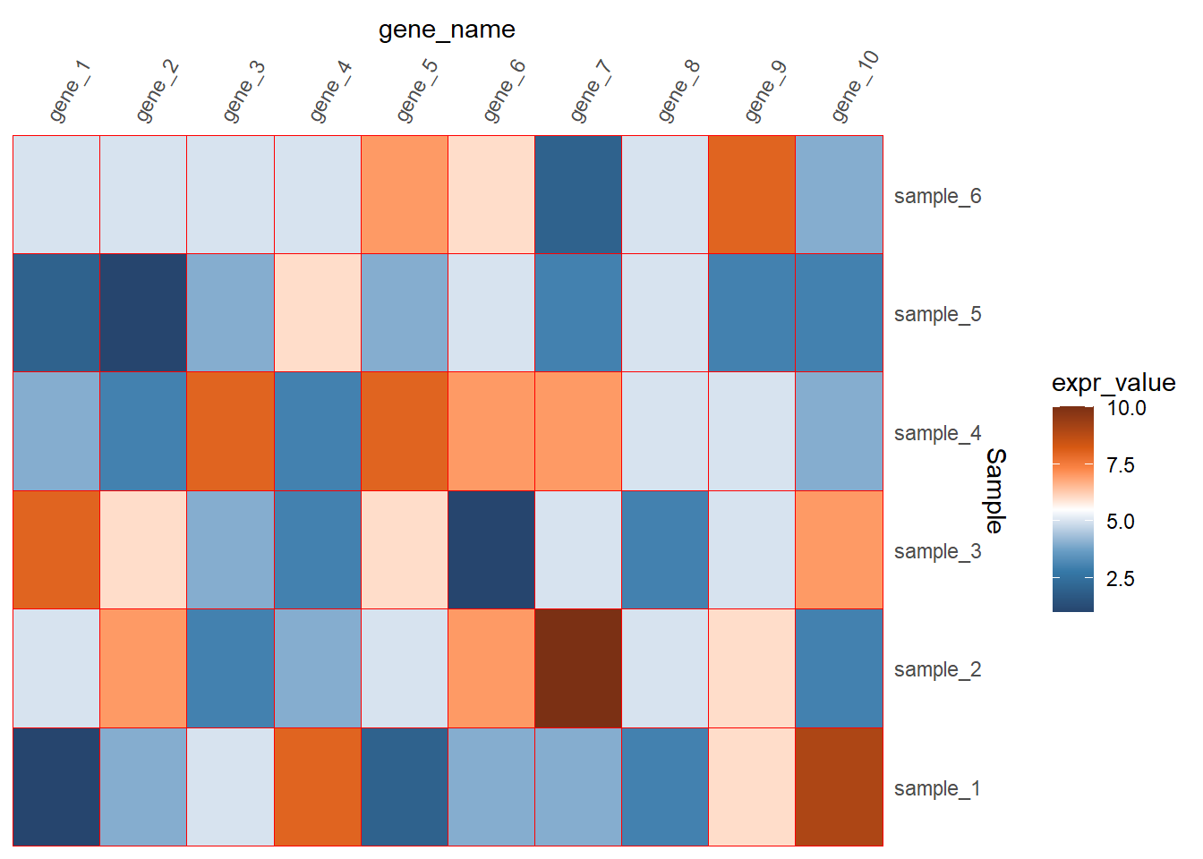
在色块上添加文本,用geom_text()函数来添加
library(readxl)
dat01<-read_excel("example_data/08-heatmap/03_heatmap_example.xlsx")
head(dat01)
## # A tibble: 6 x 3
## gene_name Sample expr_value
## <chr> <chr> <dbl>
## 1 gene_1 sample_1 1
## 2 gene_1 sample_2 5
## 3 gene_1 sample_3 8
## 4 gene_1 sample_4 4
## 5 gene_1 sample_5 2
## 6 gene_1 sample_6 5dat01$gene_name<-factor(dat01$gene_name,
levels = c("gene_1","gene_2","gene_3",
"gene_4","gene_5","gene_6",
"gene_7","gene_8","gene_9",
"gene_10"))
library(ggplot2)
library(paletteer)
ggplot(data=dat01,aes(x=gene_name,y=Sample))+
geom_tile(aes(fill=expr_value),color="red")+
scale_fill_paletteer_c("ggthemes::Classic Orange-White-Blue",
direction = -1)+
scale_x_discrete(position = "top",
expand = expansion(mult = c(0,0)))+
scale_y_discrete(position = "right",
expand = expansion(mult = c(0,0)))+
theme(axis.text.x = element_text(angle=60,hjust=0,vjust=1),
axis.ticks = element_blank(),
panel.background = element_blank())+
geom_text(aes(label=expr_value))
调整图例的细节
参考公众号推文 ggplot2画热图展示相关系数的简单小例子
截断和标签是在scale_fill函数里设置breaks和labels
图例的位置是在主题里进行设置
其他一些细节在guides函数里设置
library(readxl)
dat01<-read_excel("example_data/08-heatmap/03_heatmap_example.xlsx")
head(dat01)
## # A tibble: 6 x 3
## gene_name Sample expr_value
## <chr> <chr> <dbl>
## 1 gene_1 sample_1 1
## 2 gene_1 sample_2 5
## 3 gene_1 sample_3 8
## 4 gene_1 sample_4 4
## 5 gene_1 sample_5 2
## 6 gene_1 sample_6 5dat01$gene_name<-factor(dat01$gene_name,
levels = c("gene_1","gene_2","gene_3",
"gene_4","gene_5","gene_6",
"gene_7","gene_8","gene_9",
"gene_10"))
library(ggplot2)
library(paletteer)
ggplot(data=dat01,aes(x=gene_name,y=Sample))+
geom_tile(aes(fill=expr_value),color="red")+
scale_fill_paletteer_c("ggthemes::Classic Orange-White-Blue",
direction = -1,
breaks=c(1.1,3,5,7,9,9.9),
labels=c(1,3,5,7,9,10))+
scale_x_discrete(position = "top",
expand = expansion(mult = c(0,0)))+
scale_y_discrete(position = "right",
expand = expansion(mult = c(0,0)))+
theme(axis.text.x = element_text(angle=60,hjust=0,vjust=1),
axis.ticks = element_blank(),
panel.background = element_blank())+
geom_text(aes(label=expr_value))+
theme(legend.position = "top")+
guides(fill=guide_colorbar(title = "AAA",
title.position = "top",
title.hjust = 0.5,
barwidth = 20,
ticks = FALSE,
label = TRUE))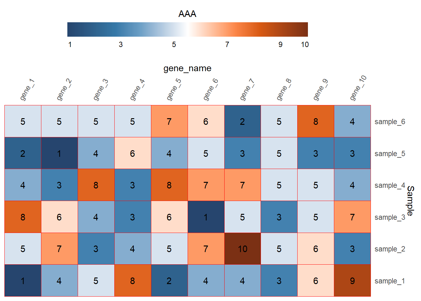
以上介绍的用来填充颜色的数据是连续型的,数据是离散的也是可以的,比如只关心某个基因在样本中是否表达,并不关心这个基因的表达量高低,示例数据如下
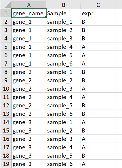
这里A代表基因表达B代表基因不表达,这个AB可以用任意字符代替
library(readxl)
dat01<-read_excel("example_data/08-heatmap/04_heatmap_example.xlsx")
head(dat01)## # A tibble: 6 x 3
## gene_name Sample expr
## <chr> <chr> <chr>
## 1 gene_1 sample_1 B
## 2 gene_1 sample_2 B
## 3 gene_1 sample_3 B
## 4 gene_1 sample_4 A
## 5 gene_1 sample_5 A
## 6 gene_1 sample_6 Adat01$gene_name<-factor(dat01$gene_name,
levels = c("gene_1","gene_2","gene_3",
"gene_4","gene_5","gene_6",
"gene_7","gene_8","gene_9",
"gene_10"))
library(ggplot2)
ggplot(data=dat01,aes(x=gene_name,y=Sample))+
geom_tile(aes(fill=expr),color="blue")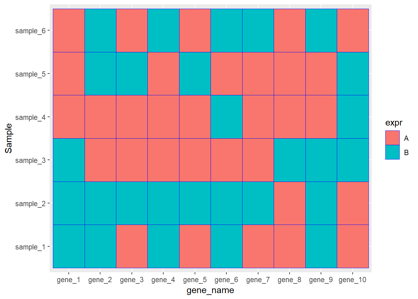
ggplot(data=dat01,aes(x=gene_name,y=Sample))+
geom_tile(aes(fill=expr),color="blue")+
scale_fill_manual(values = c("A"="#fe0904",
"B"='#f9b54f'))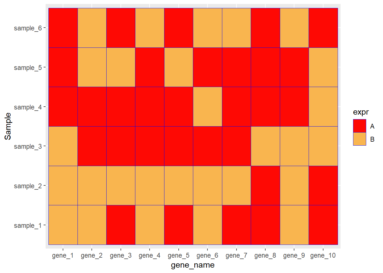
ggplot(data=dat01,aes(x=gene_name,y=Sample))+
geom_tile(aes(fill=expr),color="blue")+
scale_fill_manual(values = c("A"="#fe0904",
"B"='white'))+
theme_bw()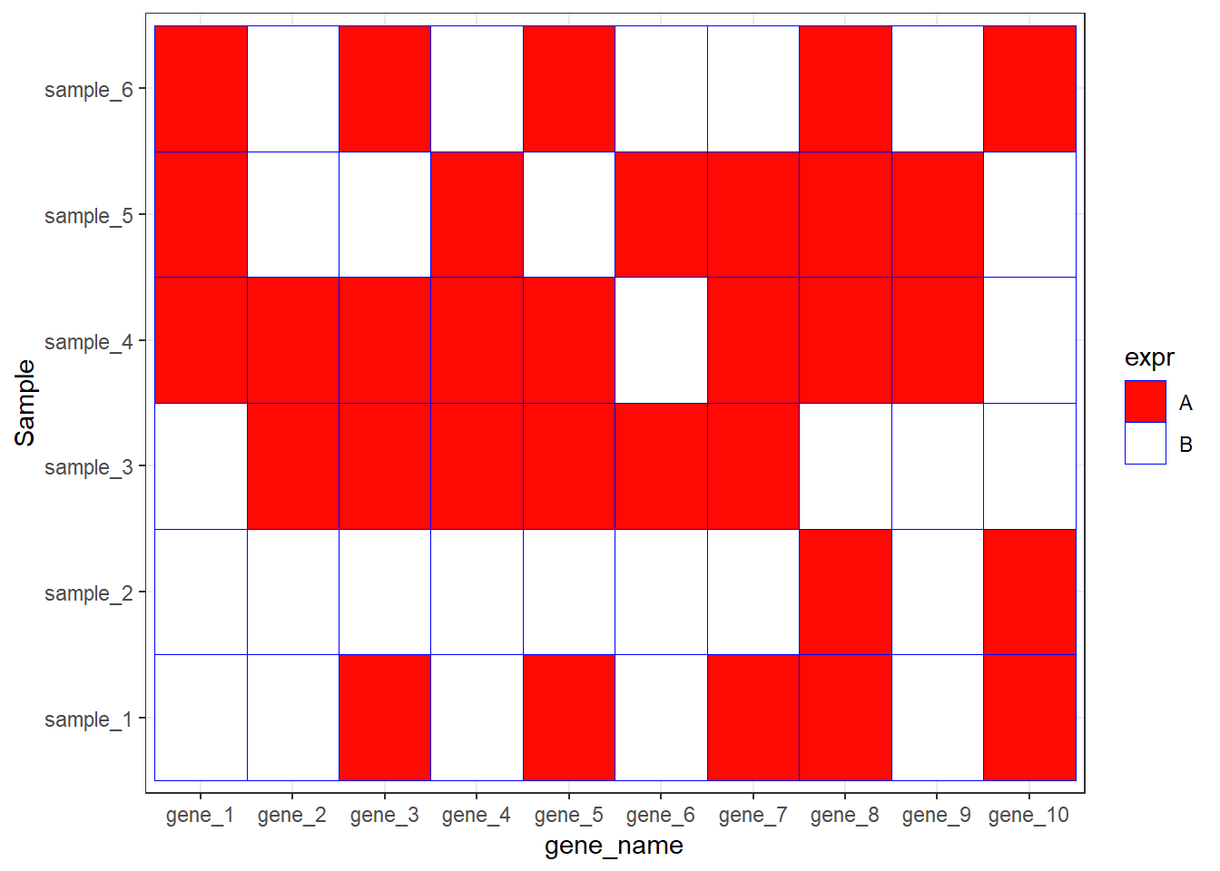
8.3 ggplot2气泡热图图
如果x 和 y都是离散的,把热图函数geom_tile()换成geom_point()函数,然后用表达量的值映射点的大小 同时映射颜色 也可以归为热图的一种
比如
library(readxl)
dat01<-read_excel("example_data/08-heatmap/03_heatmap_example.xlsx")
head(dat01)
## # A tibble: 6 x 3
## gene_name Sample expr_value
## <chr> <chr> <dbl>
## 1 gene_1 sample_1 1
## 2 gene_1 sample_2 5
## 3 gene_1 sample_3 8
## 4 gene_1 sample_4 4
## 5 gene_1 sample_5 2
## 6 gene_1 sample_6 5dat01$gene_name<-factor(dat01$gene_name,
levels = c("gene_1","gene_2","gene_3",
"gene_4","gene_5","gene_6",
"gene_7","gene_8","gene_9",
"gene_10"))
library(ggplot2)
ggplot(data=dat01,aes(x=gene_name,y=Sample))+
geom_point(aes(fill=expr_value,
size=expr_value),color="blue",shape=21)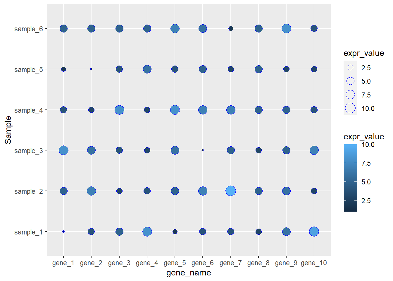
更改默认的配色和点的大小
library(readxl)
dat01<-read_excel("example_data/08-heatmap/03_heatmap_example.xlsx")
head(dat01)
## # A tibble: 6 x 3
## gene_name Sample expr_value
## <chr> <chr> <dbl>
## 1 gene_1 sample_1 1
## 2 gene_1 sample_2 5
## 3 gene_1 sample_3 8
## 4 gene_1 sample_4 4
## 5 gene_1 sample_5 2
## 6 gene_1 sample_6 5dat01$gene_name<-factor(dat01$gene_name,
levels = c("gene_1","gene_2","gene_3",
"gene_4","gene_5","gene_6",
"gene_7","gene_8","gene_9",
"gene_10"))
library(ggplot2)
library(paletteer)
ggplot(data=dat01,aes(x=gene_name,y=Sample))+
geom_point(aes(fill=expr_value,
size=expr_value),color="blue",shape=21)+
scale_fill_paletteer_c("ggthemes::Classic Orange-White-Blue",
direction = -1)+
scale_size_continuous(range = c(1,20),
guide = guide_legend(override.aes = list(size = c(1,2,3,5)) ))
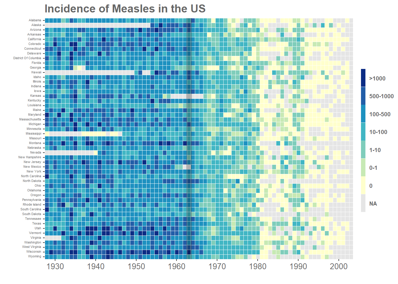
8.4 一个完整的例子
来源 https://www.royfrancis.com/a-guide-to-elegant-tiled-heatmaps-in-r-2019/
library(reshape2)##
## Attaching package: 'reshape2'## The following object is masked from 'package:tidyr':
##
## smithslibrary(ggplot2)
m <- read.csv("example_data/08-heatmap/measles_lev1.txt",
header = T,
stringsAsFactors = F,
skip = 2)
m2 <- melt(m,id.vars = c("YEAR", "WEEK"))
#rename column names
colnames(m2) <- c("Year", "Week", "State", "Value")
#inspect data
head(m2)## Year Week State Value
## 1 1928 1 ALABAMA 3.67
## 2 1928 2 ALABAMA 6.25
## 3 1928 3 ALABAMA 7.95
## 4 1928 4 ALABAMA 12.58
## 5 1928 5 ALABAMA 8.03
## 6 1928 6 ALABAMA 7.27table(m2$State)##
## ALABAMA ALASKA ARIZONA ARKANSAS
## 3952 3952 3952 3952
## CALIFORNIA COLORADO CONNECTICUT DELAWARE
## 3952 3952 3952 3952
## DISTRICT.OF.COLUMBIA FLORIDA GEORGIA HAWAII
## 3952 3952 3952 3952
## IDAHO ILLINOIS INDIANA IOWA
## 3952 3952 3952 3952
## KANSAS KENTUCKY LOUISIANA MAINE
## 3952 3952 3952 3952
## MARYLAND MASSACHUSETTS MICHIGAN MINNESOTA
## 3952 3952 3952 3952
## MISSISSIPPI MISSOURI MONTANA NEBRASKA
## 3952 3952 3952 3952
## NEVADA NEW.HAMPSHIRE NEW.JERSEY NEW.MEXICO
## 3952 3952 3952 3952
## NEW.YORK NORTH.CAROLINA NORTH.DAKOTA OHIO
## 3952 3952 3952 3952
## OKLAHOMA OREGON PENNSYLVANIA RHODE.ISLAND
## 3952 3952 3952 3952
## SOUTH.CAROLINA SOUTH.DAKOTA TENNESSEE TEXAS
## 3952 3952 3952 3952
## UTAH VERMONT VIRGINIA WASHINGTON
## 3952 3952 3952 3952
## WEST.VIRGINIA WISCONSIN WYOMING
## 3952 3952 3952camelCase <- function(string=NULL,separator="\\."){
if(is.null(string))
stop("No input string.n")
s <- strsplit(string, separator)
s <- tolower(s[[1]])
paste(toupper(substring(s, 1, 1)), substring(s, 2),sep = "", collapse = " ")
}
#change variable to character, convert to camel case,
#remove dot and change variable back to factor
m2$State <- factor(as.character(sapply(as.character(m2$State),camelCase)))
m2$Year <- factor(m2$Year)
m2$Week <- factor(m2$Week)
#also converts '-' to NA
m2$Value <- as.numeric(m2$Value)## Warning: NAs introduced by coercionnaSum <- function(x)
{
if(all(is.na(x))) val <- sum(x,na.rm=F)
if(!all(is.na(x))) val <- sum(x,na.rm=T)
return(val)
}
#sums incidences for all weeks into one year
m3 <- plyr::ddply(m2,c("Year","State"),Incidence=round(naSum(Value),0),plyr::summarise)
#inspect data
head(m3)## Year State Incidence
## 1 1928 Alabama 335
## 2 1928 Alaska NA
## 3 1928 Arizona 201
## 4 1928 Arkansas 482
## 5 1928 California 69
## 6 1928 Colorado 207str(m3)## 'data.frame': 3876 obs. of 3 variables:
## $ Year : Factor w/ 76 levels "1928","1929",..: 1 1 1 1 1 1 1 1 1 1 ...
## $ State : Factor w/ 51 levels "Alabama","Alaska",..: 1 2 3 4 5 6 7 8 9 10 ...
## $ Incidence: num 335 NA 201 482 69 207 635 256 536 120 ...m3$State <- factor(as.character(m3$State),levels=rev(levels(m3$State)))
#create a new variable from incidence
m3$IncidenceFactor <- cut(m3$Incidence,
breaks = c(-1,0,1,10,100,500,1000,max(m3$Incidence,na.rm=T)),
labels=c("0","0-1","1-10","10-100","100-500","500-1000",">1000"))
#change level order
m3$IncidenceFactor <- factor(as.character(m3$IncidenceFactor),
levels=rev(levels(m3$IncidenceFactor)))
textcol <- "grey40"
#modified ggplot
p <- ggplot(m3,aes(x=Year,y=State,fill=IncidenceFactor))+
geom_tile()+
#redrawing tiles to remove cross lines from legend
geom_tile(colour="white",size=0.25, show_guide=FALSE)+
#remove axis labels, add title
labs(x="",y="",title="Incidence of Measles in the US")+
#remove extra space
scale_y_discrete(expand=c(0,0))+
#custom breaks on x-axis
scale_x_discrete(expand=c(0,0),
breaks=c("1930","1940","1950","1960","1970","1980","1990","2000"))+
#custom colours for cut levels and na values
scale_fill_manual(values=c("#d53e4f","#f46d43","#fdae61",
"#fee08b","#e6f598","#abdda4","#ddf1da"),na.value="grey90")+
#mark year of vaccination
geom_vline(aes(xintercept = 36),size=3.4,alpha=0.24)+
#equal aspect ratio x and y axis
#coord_fixed()+
#set base size for all font elements
theme_grey(base_size=10)+
#theme options
theme(
#remove legend title
legend.title=element_blank(),
#remove legend margin
legend.margin = grid::unit(0,"cm"),
#change legend text properties
legend.text=element_text(colour=textcol,size=7,face="bold"),
#change legend key height
legend.key.height=grid::unit(0.8,"cm"),
#set a slim legend
legend.key.width=grid::unit(0.2,"cm"),
#set x axis text size and colour
axis.text.x=element_text(size=10,colour=textcol),
#set y axis text colour and adjust vertical justification
axis.text.y=element_text(vjust = 0.2,colour=textcol,size=4),
#change axis ticks thickness
axis.ticks=element_line(size=0.4),
#change title font, size, colour and justification
plot.title=element_text(colour=textcol,hjust=0,size=14,face="bold"),
#remove plot background
plot.background=element_blank(),
#remove plot border
panel.border=element_blank())## Warning: `show_guide` has been deprecated. Please use `show.legend` instead.## Warning: `legend.margin` must be specified using `margin()`. For the old behavior use
## legend.spacingp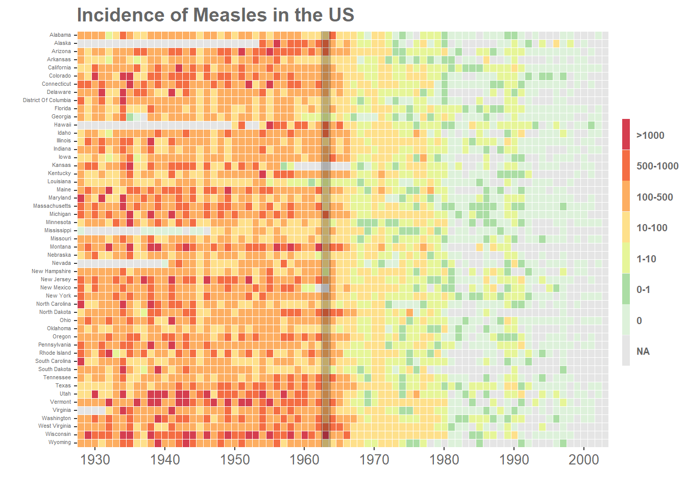
library(RColorBrewer)## Warning: package 'RColorBrewer' was built under R version 4.0.5#change the scale_fill_manual from previous code to below
p+
scale_fill_manual(values=rev(brewer.pal(7,"YlGnBu")),
na.value="grey90")## Scale for 'fill' is already present. Adding another scale for 'fill', which will replace
## the existing scale.