Chapter 5 R语言ggplot2箱线图
这一章主要介绍的是 箱线图 小提琴图 蜂群图 山脊图 这类,因为他们的作用都是一样的,主要就是为了展示数据分布
5.1 首先是箱线图
最基本的箱线图需要准备两列数据
读取数据
library(readxl)
dat01<-read_excel("example_data/05-boxplot/dat01_1.xlsx")
head(dat01)
## # A tibble: 6 x 2
## var1 var2
## <chr> <dbl>
## 1 PAR_CH 0.571
## 2 PAR_CH 0.432
## 3 PAR_CH 0.645
## 4 PAR_CH 0.590
## 5 PAR_CH 0.740
## 6 PAR_CH 0.591做箱线图使用到的函数是geom_boxplot()
最基本的箱线图的代码
library(readxl)
dat01<-read_excel("example_data/05-boxplot/dat01_1.xlsx")
head(dat01)
## # A tibble: 6 x 2
## var1 var2
## <chr> <dbl>
## 1 PAR_CH 0.571
## 2 PAR_CH 0.432
## 3 PAR_CH 0.645
## 4 PAR_CH 0.590
## 5 PAR_CH 0.740
## 6 PAR_CH 0.591library(ggplot2)
ggplot(data=dat01,aes(x=var1,y=var2))+
geom_boxplot()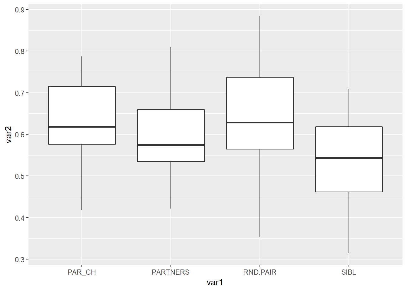
箱线图比较常修改的参数是
color 边框颜色
fill 填充颜色
width 箱子整体的宽度
如果要修改成统一的颜色,就把参数写到aes()的外面,参数值是真实的颜色
library(readxl)
dat01<-read_excel("example_data/05-boxplot/dat01_1.xlsx")
head(dat01)
## # A tibble: 6 x 2
## var1 var2
## <chr> <dbl>
## 1 PAR_CH 0.571
## 2 PAR_CH 0.432
## 3 PAR_CH 0.645
## 4 PAR_CH 0.590
## 5 PAR_CH 0.740
## 6 PAR_CH 0.591library(ggplot2)
ggplot(data=dat01,aes(x=var1,y=var2))+
geom_boxplot(color="red",
fill="blue",
width=0.2)
如果要根据不同的变量赋予不同的颜色,就把参数写到aes()的里面,参数值是数据的列名
library(readxl)
dat01<-read_excel("example_data/05-boxplot/dat01_1.xlsx")
head(dat01)
## # A tibble: 6 x 2
## var1 var2
## <chr> <dbl>
## 1 PAR_CH 0.571
## 2 PAR_CH 0.432
## 3 PAR_CH 0.645
## 4 PAR_CH 0.590
## 5 PAR_CH 0.740
## 6 PAR_CH 0.591library(ggplot2)
ggplot(data=dat01,aes(x=var1,y=var2))+
geom_boxplot(aes(fill=var1))
箱线图还有一个比较常用的操作是添加顶部和底部的小短线,这个geom_boxplot()函数里好像没有专门的参数设置,需要我们借助误差线函数geom_errorbar()来添加,这里展示的不是真实误差,而是数据集的最大值和最小值
这里需要先生成一个新的数据集,每个变量的最小值和最大值
library(readxl)
dat01<-read_excel("example_data/05-boxplot/dat01_1.xlsx")
head(dat01)
## # A tibble: 6 x 2
## var1 var2
## <chr> <dbl>
## 1 PAR_CH 0.571
## 2 PAR_CH 0.432
## 3 PAR_CH 0.645
## 4 PAR_CH 0.590
## 5 PAR_CH 0.740
## 6 PAR_CH 0.591library(tidyverse)
dat01 %>%
group_by(var1) %>%
summarise(max_value=max(var2),
min_value=min(var2)) -> dat01.1
dat01.1## # A tibble: 4 x 3
## var1 max_value min_value
## <chr> <dbl> <dbl>
## 1 PAR_CH 0.787 0.418
## 2 PARTNERS 0.810 0.422
## 3 RND.PAIR 0.884 0.354
## 4 SIBL 0.709 0.315用这个新的数据集添加小短线
library(readxl)
dat01<-read_excel("example_data/05-boxplot/dat01_1.xlsx")
head(dat01)
## # A tibble: 6 x 2
## var1 var2
## <chr> <dbl>
## 1 PAR_CH 0.571
## 2 PAR_CH 0.432
## 3 PAR_CH 0.645
## 4 PAR_CH 0.590
## 5 PAR_CH 0.740
## 6 PAR_CH 0.591library(tidyverse)
dat01 %>%
group_by(var1) %>%
summarise(max_value=max(var2),
min_value=min(var2)) -> dat01.1
dat01.1## # A tibble: 4 x 3
## var1 max_value min_value
## <chr> <dbl> <dbl>
## 1 PAR_CH 0.787 0.418
## 2 PARTNERS 0.810 0.422
## 3 RND.PAIR 0.884 0.354
## 4 SIBL 0.709 0.315library(ggplot2)
ggplot()+
geom_boxplot(data=dat01,aes(x=var1,y=var2,fill=var1))+
geom_errorbar(data=dat01.1,
aes(x=var1,
ymin=min_value,
ymax=max_value))
ggplot()+
  geom_errorbar(data=dat01.1,
                aes(x=var1,
                    ymin=min_value,
                    ymax=max_value))+
  geom_boxplot(data=dat01,aes(x=var1,y=var2,fill=var1))
这里有一个知识点是每一个作图函数都可以用不同的数据集,如果要在同一个图上用不同的数据集的话,尽量把数据集接到作图函数里,不写到ggplot()函数里
ggplot2作图是不同函数依次叠加,所以排在后面的函数生成的图形会把前面的覆盖掉,如果觉得有影响 调换一下函数的顺序就可以
误差线函数对应的可以修改的参数比较常用的就是 - width 宽度 - color 颜色 - lty 线型
library(readxl)
dat01<-read_excel("example_data/05-boxplot/dat01_1.xlsx")
head(dat01)
## # A tibble: 6 x 2
## var1 var2
## <chr> <dbl>
## 1 PAR_CH 0.571
## 2 PAR_CH 0.432
## 3 PAR_CH 0.645
## 4 PAR_CH 0.590
## 5 PAR_CH 0.740
## 6 PAR_CH 0.591library(tidyverse)
dat01 %>%
group_by(var1) %>%
summarise(max_value=max(var2),
min_value=min(var2)) -> dat01.1
dat01.1## # A tibble: 4 x 3
## var1 max_value min_value
## <chr> <dbl> <dbl>
## 1 PAR_CH 0.787 0.418
## 2 PARTNERS 0.810 0.422
## 3 RND.PAIR 0.884 0.354
## 4 SIBL 0.709 0.315library(ggplot2)
ggplot()+
geom_errorbar(data=dat01.1,
aes(x=var1,
ymin=min_value,
ymax=max_value),
color="red",width=0.3,lty="dashed")+
geom_boxplot(data=dat01,aes(x=var1,y=var2,fill=var1))
箱线图有时候还会添加统计检验的显著性等信息,额外的注释信息都可以借助annotate()函数实现,这里的一个小知识点是离散变量的x轴第一个位置是x=1
annotate() 函数比较常用的是添加文本和线段
添加文本需要用到的参数是 - geom = “text” - x,y的坐标 - label 文本的内容
library(readxl)
dat01<-read_excel("example_data/05-boxplot/dat01_1.xlsx")
head(dat01)
## # A tibble: 6 x 2
## var1 var2
## <chr> <dbl>
## 1 PAR_CH 0.571
## 2 PAR_CH 0.432
## 3 PAR_CH 0.645
## 4 PAR_CH 0.590
## 5 PAR_CH 0.740
## 6 PAR_CH 0.591library(tidyverse)
dat01 %>%
group_by(var1) %>%
summarise(max_value=max(var2),
min_value=min(var2)) -> dat01.1
dat01.1## # A tibble: 4 x 3
## var1 max_value min_value
## <chr> <dbl> <dbl>
## 1 PAR_CH 0.787 0.418
## 2 PARTNERS 0.810 0.422
## 3 RND.PAIR 0.884 0.354
## 4 SIBL 0.709 0.315library(ggplot2)
ggplot()+
geom_errorbar(data=dat01.1,
aes(x=var1,
ymin=min_value,
ymax=max_value),
color="red",width=0.3,lty="dashed")+
geom_boxplot(data=dat01,aes(x=var1,y=var2,fill=var1))+
annotate(geom="text",x=1.5,y=0.85,
label="Pvalue = 0.01",color="blue",
fontface="italic")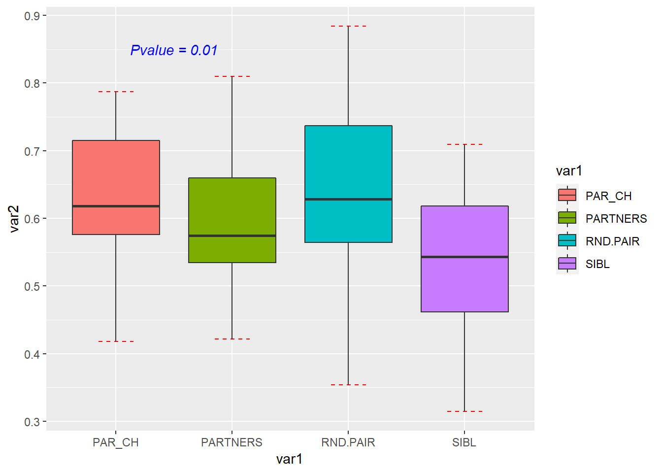
添加线段需要用到的参数是 - geom = “segment” - 线段起始位置的x,y坐标和线段终止位置的x,y坐标
library(readxl)
dat01<-read_excel("example_data/05-boxplot/dat01_1.xlsx")
head(dat01)
## # A tibble: 6 x 2
## var1 var2
## <chr> <dbl>
## 1 PAR_CH 0.571
## 2 PAR_CH 0.432
## 3 PAR_CH 0.645
## 4 PAR_CH 0.590
## 5 PAR_CH 0.740
## 6 PAR_CH 0.591library(tidyverse)
dat01 %>%
group_by(var1) %>%
summarise(max_value=max(var2),
min_value=min(var2)) -> dat01.1
dat01.1## # A tibble: 4 x 3
## var1 max_value min_value
## <chr> <dbl> <dbl>
## 1 PAR_CH 0.787 0.418
## 2 PARTNERS 0.810 0.422
## 3 RND.PAIR 0.884 0.354
## 4 SIBL 0.709 0.315library(ggplot2)
ggplot()+
geom_errorbar(data=dat01.1,
aes(x=var1,
ymin=min_value,
ymax=max_value),
color="red",width=0.3,lty="dashed")+
geom_boxplot(data=dat01,aes(x=var1,y=var2,fill=var1))+
annotate(geom="text",x=1.5,y=0.85,
label="Pvalue = 0.01",color="blue",
fontface="italic")+
annotate(geom = "segment",
x = 1,y = 0.8,
xend = 1,yend = 0.82,
size=1) annotate()函数添加相对比较繁琐,但可定制性比较强
再来添加两条线段
library(readxl)
dat01<-read_excel("example_data/05-boxplot/dat01_1.xlsx")
head(dat01)
## # A tibble: 6 x 2
## var1 var2
## <chr> <dbl>
## 1 PAR_CH 0.571
## 2 PAR_CH 0.432
## 3 PAR_CH 0.645
## 4 PAR_CH 0.590
## 5 PAR_CH 0.740
## 6 PAR_CH 0.591library(tidyverse)
dat01 %>%
group_by(var1) %>%
summarise(max_value=max(var2),
min_value=min(var2)) -> dat01.1
dat01.1## # A tibble: 4 x 3
## var1 max_value min_value
## <chr> <dbl> <dbl>
## 1 PAR_CH 0.787 0.418
## 2 PARTNERS 0.810 0.422
## 3 RND.PAIR 0.884 0.354
## 4 SIBL 0.709 0.315library(ggplot2)
ggplot()+
geom_errorbar(data=dat01.1,
aes(x=var1,
ymin=min_value,
ymax=max_value),
color="red",width=0.3,lty="dashed")+
geom_boxplot(data=dat01,aes(x=var1,y=var2,fill=var1))+
annotate(geom="text",x=1.5,y=0.85,
label="Pvalue = 0.01",color="blue",
fontface="italic")+
annotate(geom = "segment",
x = 1,y = 0.8,
xend = 1,yend = 0.82,
size=1)+
annotate(geom = "segment",
x = 1,y = 0.82,
xend = 2,yend = 0.82,
size=1)+
annotate(geom = "segment",
x = 2,y = 0.82,
xend = 2,yend = 0.815,
size=1)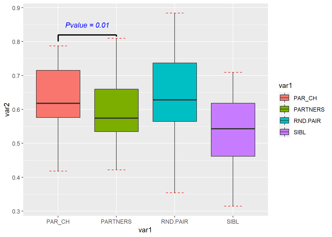 如果还想在不同的位置添加文本和线段,可以按照上述思路来设置
5.2 接下来是带有分组的箱线图
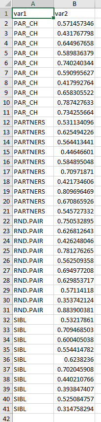
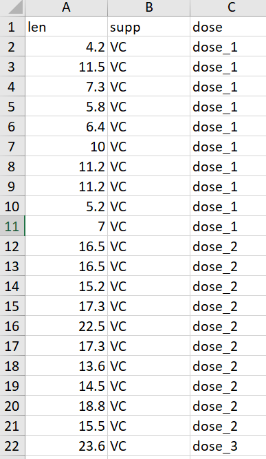
部分示例数据集如下
最基本的分组箱线图
library(readxl)
dat02<-read_excel("example_data/05-boxplot/dat02.xlsx")
library(ggplot2)
ggplot(data=dat02,aes(x=dose,y=len,fill=supp))+
  geom_boxplot()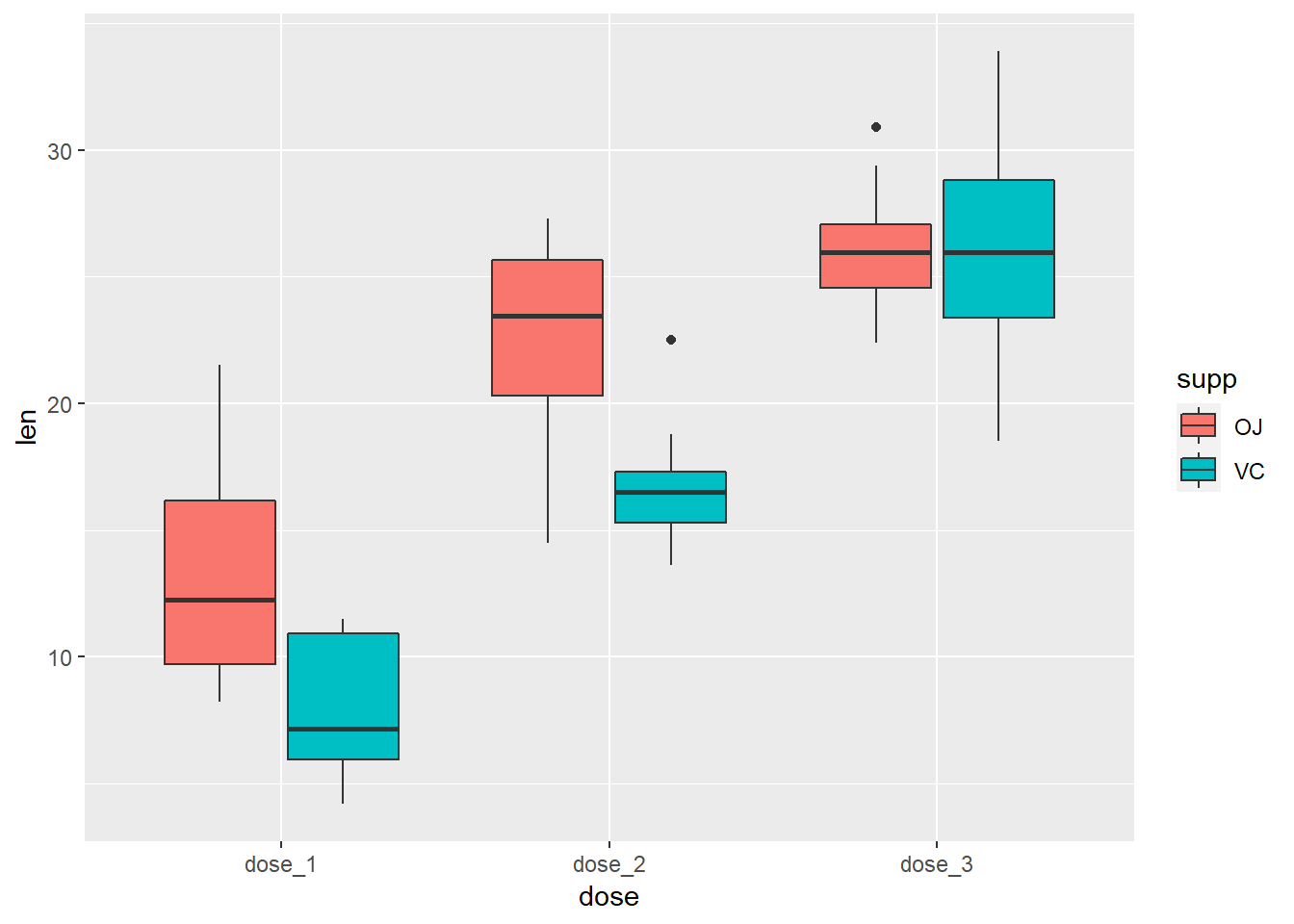
分组箱线图添加误差线,还是需要先生成一个新的数据集
library(readxl)
dat02<-read_excel("example_data/05-boxplot/dat02.xlsx")
library(tidyverse)
dat02 %>%
  group_by(dose,supp) %>%
  summarise(min_value=min(len),
            max_value=max(len)) -> dat02.1
## `summarise()` has grouped output by 'dose'. You can override using the `.groups` argument.dat02.1## # A tibble: 6 x 4
## # Groups: dose [3]
## dose supp min_value max_value
## <chr> <chr> <dbl> <dbl>
## 1 dose_1 OJ 8.2 21.5
## 2 dose_1 VC 4.2 11.5
## 3 dose_2 OJ 14.5 27.3
## 4 dose_2 VC 13.6 22.5
## 5 dose_3 OJ 22.4 30.9
## 6 dose_3 VC 18.5 33.9用算好的数据添加误差线
library(readxl)
dat02<-read_excel("example_data/05-boxplot/dat02.xlsx")
library(tidyverse)
dat02 %>%
  group_by(dose,supp) %>%
  summarise(min_value=min(len),
            max_value=max(len)) -> dat02.1
## `summarise()` has grouped output by 'dose'. You can override using the `.groups` argument.dat02.1## # A tibble: 6 x 4
## # Groups: dose [3]
## dose supp min_value max_value
## <chr> <chr> <dbl> <dbl>
## 1 dose_1 OJ 8.2 21.5
## 2 dose_1 VC 4.2 11.5
## 3 dose_2 OJ 14.5 27.3
## 4 dose_2 VC 13.6 22.5
## 5 dose_3 OJ 22.4 30.9
## 6 dose_3 VC 18.5 33.9library(ggplot2)
ggplot()+
geom_errorbar(data=dat02.1,
aes(x=dose,
ymin=min_value,
ymax=max_value),
position = position_dodge(0.9),
width=0.2)+
geom_boxplot(data=dat02,aes(x=dose,y=len,fill=supp),
position = position_dodge(0.9))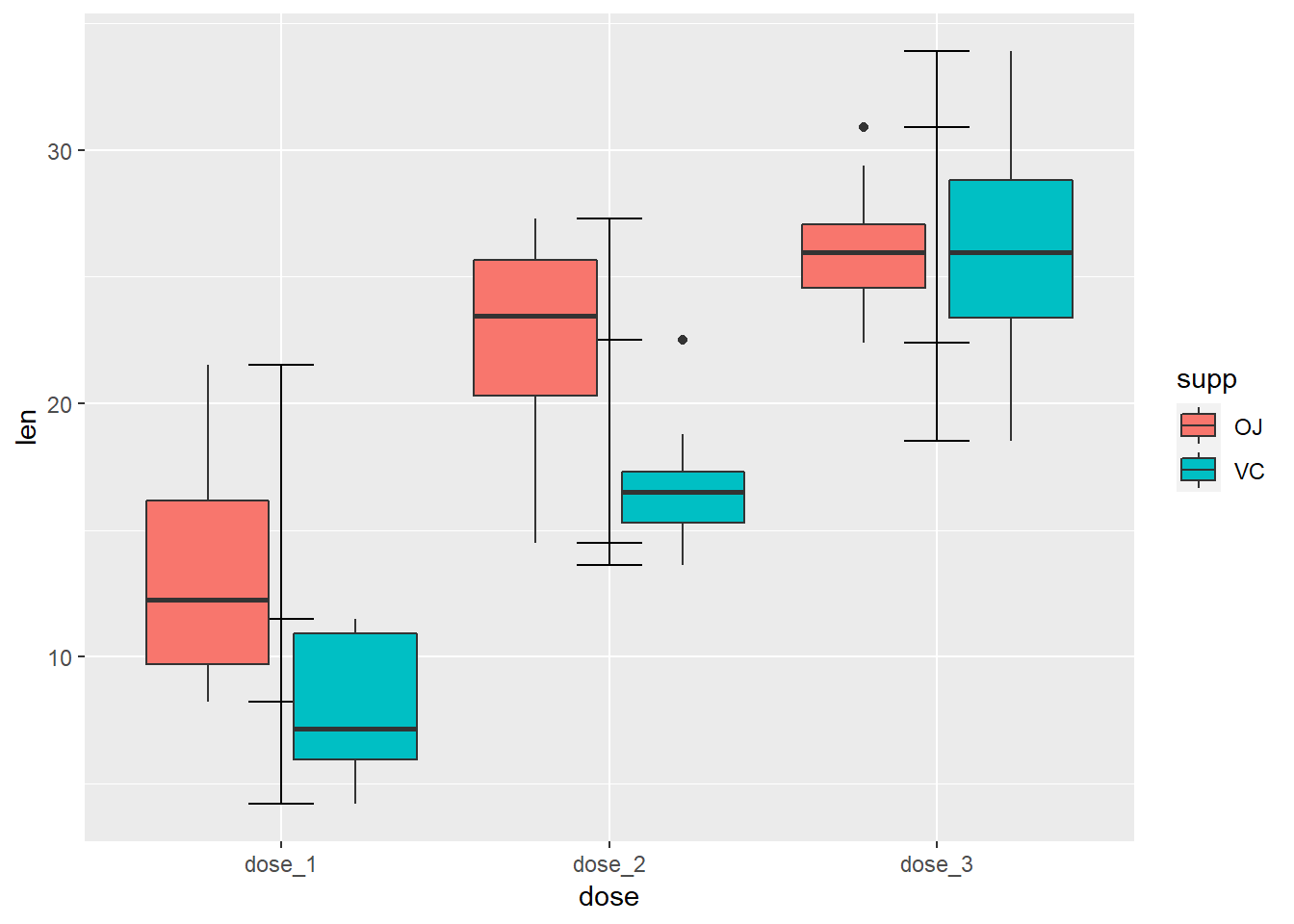
这种方式好像搞不定,这里我暂时想不到解决办法了,用另外一种方式吧
library(readxl)
dat02<-read_excel("example_data/05-boxplot/dat02.xlsx")
library(tidyverse)

library(ggplot2)
ggplot(data=dat02,aes(x=dose,y=len,fill=supp))+
    stat_boxplot(geom = "errorbar",
               width=0.3,
               position = position_dodge(0.9))+
  geom_boxplot(position = position_dodge(0.9))
之前的作图函数介绍的都是geom_ 系列的函数,这里用到了stat_系列的函数 这个戏里的函数功能很强大,但是我平时用的不多,具体用法我也不太熟,这里就不过多介绍了
接下来是分组箱线图添加额外的注释信息,这个和上面介绍的普通柱形图是一样的
library(readxl)
dat02<-read_excel("example_data/05-boxplot/dat02.xlsx")
library(tidyverse)

library(ggplot2)
ggplot(data=dat02,aes(x=dose,y=len,fill=supp))+
    stat_boxplot(geom = "errorbar",
               width=0.3,
               position = position_dodge(0.9))+
  geom_boxplot(position = position_dodge(0.9))+
  annotate(geom="text",x=1,y=25,
           label="Pvalue = 0.01",color="blue",
           fontface="italic")+
  annotate(geom = "segment",
           x = 0.6,y = 23,
           xend = 0.6,yend = 24,
           size=1)+
  annotate(geom = "segment",
           x = 0.6,y = 24,
           xend = 1.4,yend = 24,
           size=1)+
  annotate(geom = "segment",
           x = 1.4,y = 24,
           xend = 1.4,yend = 12,
           size=1)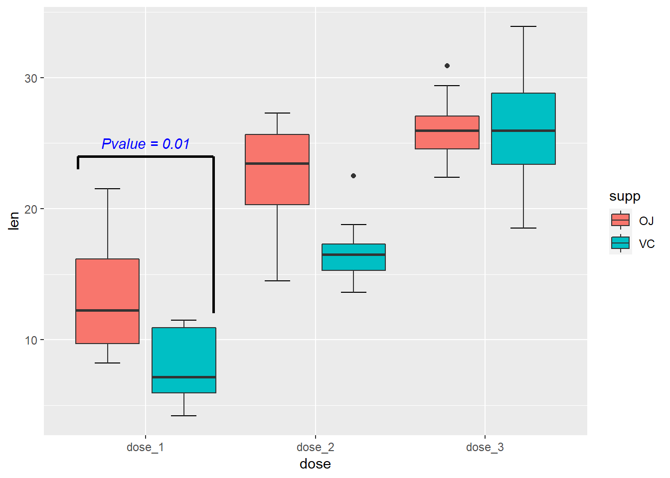
5.3 接下来是小提琴图
小提琴图整体和箱线图的作图代码是一样 的,只需要我们把作图函数换成geom_violin()
用箱线图的数据来做演示
library(readxl)
dat01<-read_excel("example_data/05-boxplot/dat01_1.xlsx")
head(dat01)
## # A tibble: 6 x 2
## var1 var2
## <chr> <dbl>
## 1 PAR_CH 0.571
## 2 PAR_CH 0.432
## 3 PAR_CH 0.645
## 4 PAR_CH 0.590
## 5 PAR_CH 0.740
## 6 PAR_CH 0.591library(ggplot2)
ggplot(data=dat01,aes(x=var1,y=var2))+
geom_violin()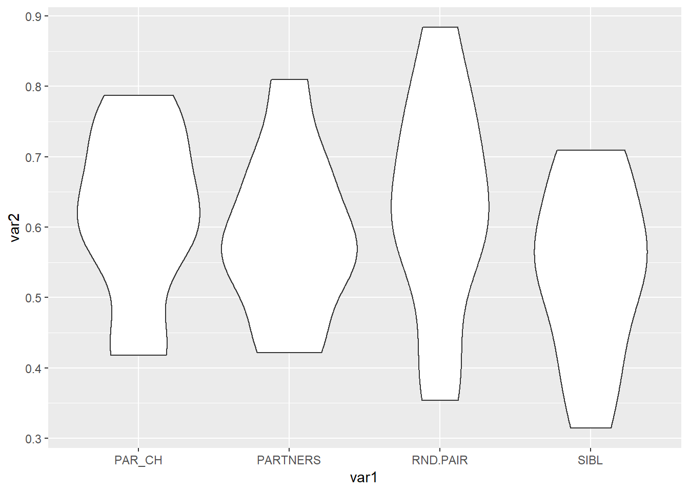
同样的可以更改边框 和填充颜色,如果四同意修改,就把参数写到aes()的外面,用真实颜色值,如果是根据不同的变量赋予不同的颜色就写到aes()的里面,用数据集的列名作为参数的值
library(readxl)
dat01<-read_excel("example_data/05-boxplot/dat01_1.xlsx")
head(dat01)
## # A tibble: 6 x 2
## var1 var2
## <chr> <dbl>
## 1 PAR_CH 0.571
## 2 PAR_CH 0.432
## 3 PAR_CH 0.645
## 4 PAR_CH 0.590
## 5 PAR_CH 0.740
## 6 PAR_CH 0.591library(ggplot2)
ggplot(data=dat01,aes(x=var1,y=var2))+
geom_violin(color="black",fill="grey")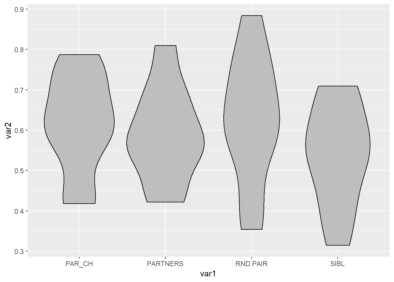
ggplot(data=dat01,aes(x=var1,y=var2))+
  geom_violin(aes(fill=var1))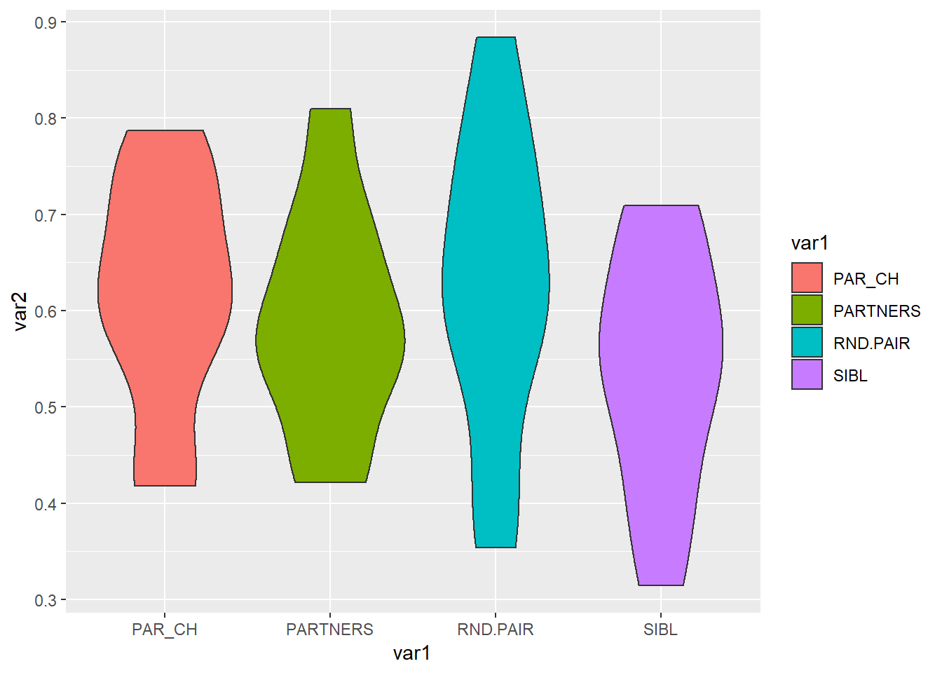
分组的小提琴图和箱线图的思路也是一样的
把上面分组箱线图的代码复制过来,把作图函数改成geom_violin()
library(readxl)
dat02<-read_excel("example_data/05-boxplot/dat02.xlsx")
library(ggplot2)
ggplot(data=dat02,aes(x=dose,y=len,fill=supp))+
  geom_violin()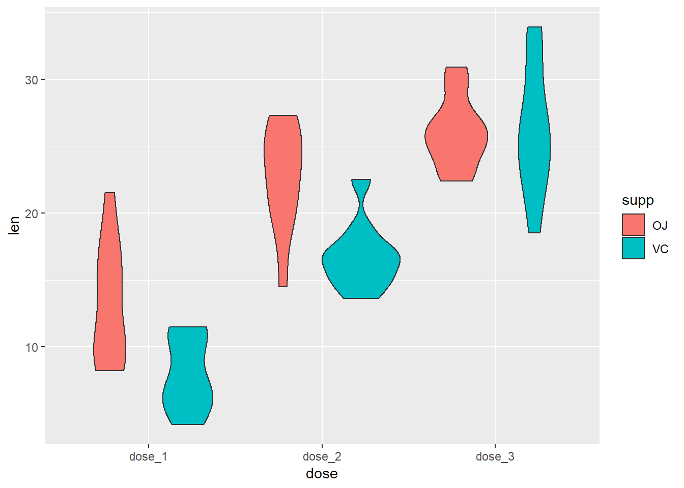
如果要添加注释信息还是使用annotate()函数
还有一个比较常用的可视化方式是箱线图和小提琴图叠加到一起
library(readxl)
dat02<-read_excel("example_data/05-boxplot/dat02.xlsx")
library(tidyverse)

library(ggplot2)
ggplot(data=dat02,aes(x=dose,y=len,fill=supp))+
  geom_violin()+
    stat_boxplot(geom = "errorbar",
               width=0.3,
               position = position_dodge(0.9))+
  geom_boxplot(position = position_dodge(0.9),
               width=0.2)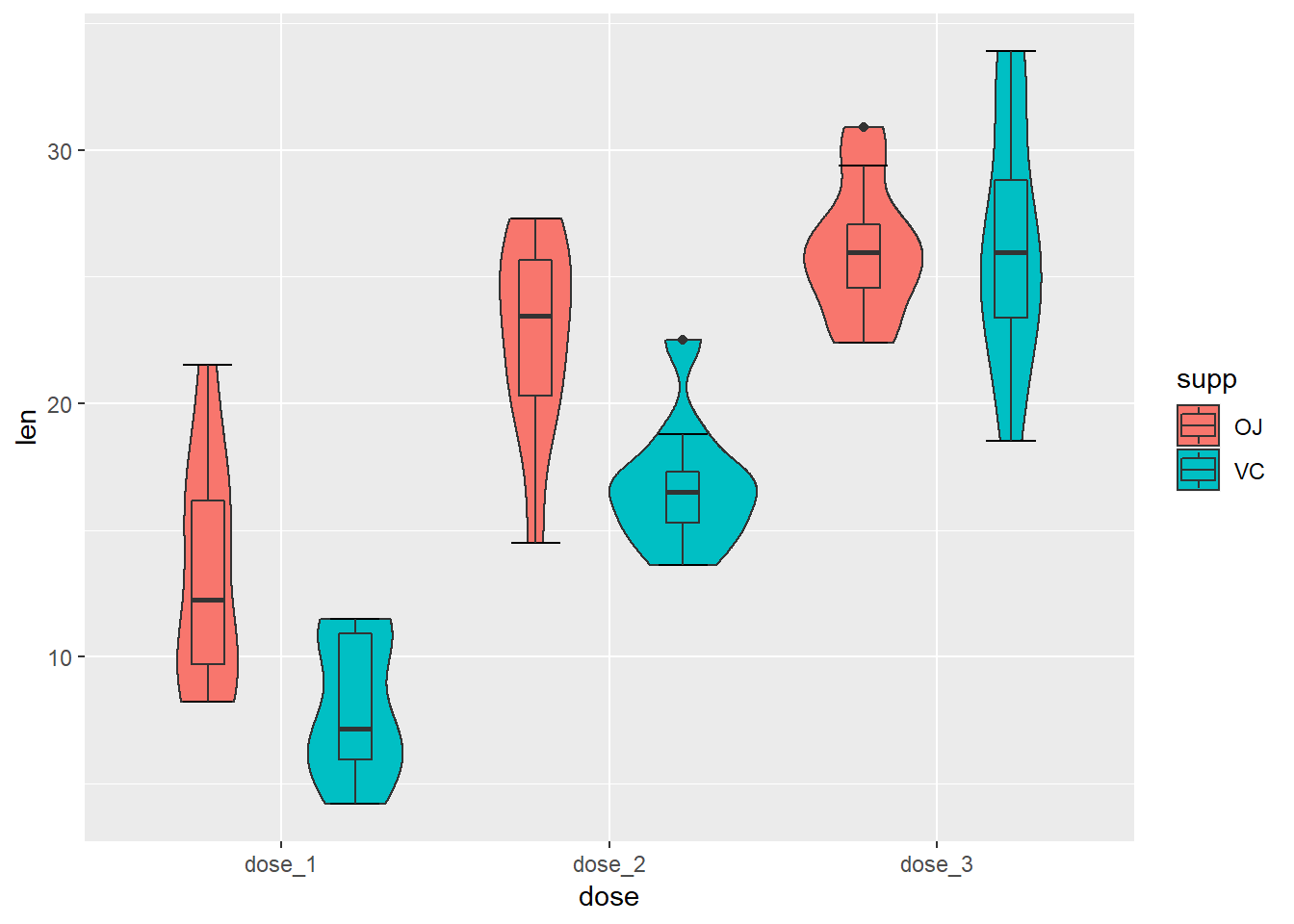
5.4 类似于箱线图/小提琴图的还有
抖动的散点图 geom_jitter()
蜂群图 需要借助额外的R包ggbeeswarm https://github.com/eclarke/ggbeeswarm
山脊图 借助额外的R包 ggridges https://cran.r-project.org/web/packages/ggridges/vignettes/introduction.html
geom_jitter
library(readxl)
dat01<-read_excel("example_data/05-boxplot/dat01_1.xlsx")
head(dat01)
## # A tibble: 6 x 2
## var1 var2
## <chr> <dbl>
## 1 PAR_CH 0.571
## 2 PAR_CH 0.432
## 3 PAR_CH 0.645
## 4 PAR_CH 0.590
## 5 PAR_CH 0.740
## 6 PAR_CH 0.591library(ggplot2)
ggplot(data=dat01,aes(x=var1,y=var2))+
geom_jitter()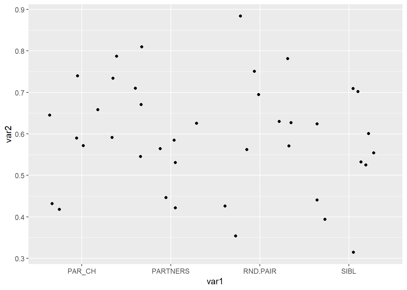
ggplot(data=dat01,aes(x=var1,y=var2))+
  geom_jitter(width=0.2,aes(color=var1))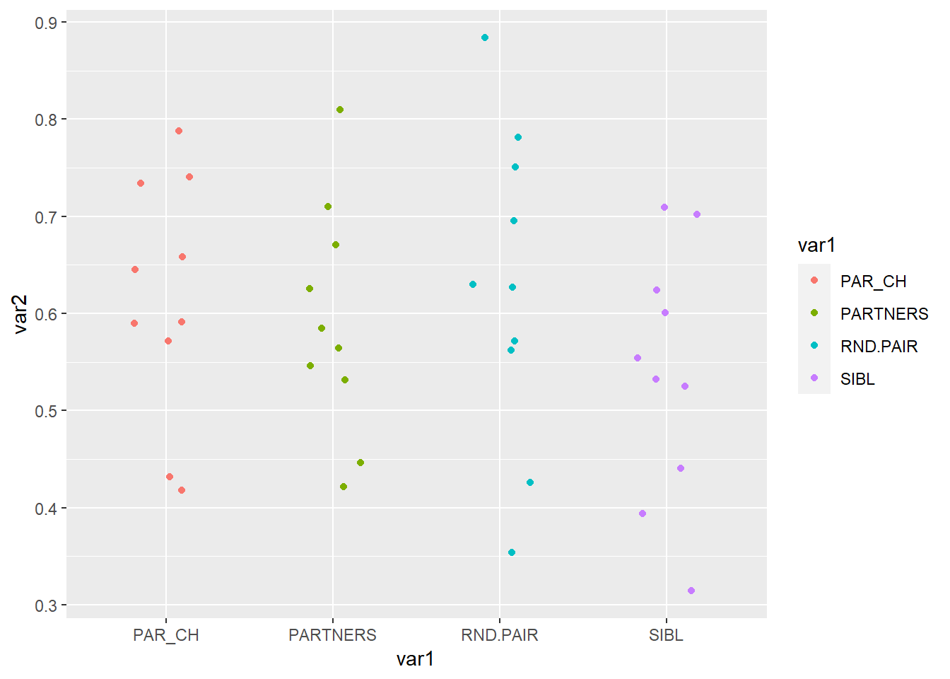
蜂群图
library(readxl)
dat01<-read_excel("example_data/05-boxplot/dat01_1.xlsx")
head(dat01)
## # A tibble: 6 x 2
## var1 var2
## <chr> <dbl>
## 1 PAR_CH 0.571
## 2 PAR_CH 0.432
## 3 PAR_CH 0.645
## 4 PAR_CH 0.590
## 5 PAR_CH 0.740
## 6 PAR_CH 0.591library(ggplot2)
library(ggbeeswarm)## Warning: package 'ggbeeswarm' was built under R version 4.0.5ggplot(data=dat01,aes(x=var1,y=var2))+
geom_quasirandom()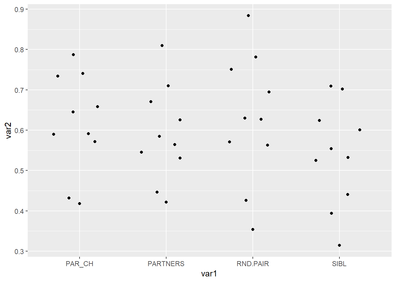
这个点比较少可能看不出差别,我们用ggbeeswarm这个包帮助文档提供的例子看下
set.seed(12345)
library(ggplot2)
library(ggbeeswarm)
#compare to jitter
ggplot(iris,aes(Species, Sepal.Length)) + geom_jitter(color="red")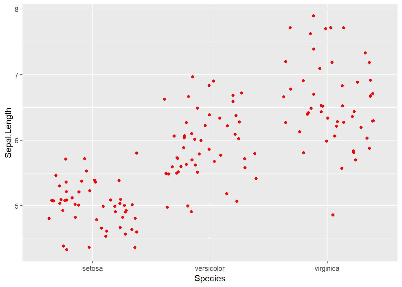
ggplot(iris,aes(Species, Sepal.Length)) + geom_quasirandom(color="blue")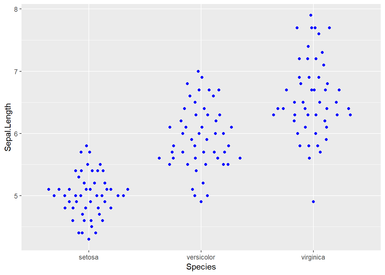
山脊图,这里直接用ggridges这个R包的帮助文档的例子
library(ggplot2)
library(ggridges)
ggplot(lincoln_weather, aes(x = `Mean Temperature [F]`, y = Month, fill = stat(x))) +
  geom_density_ridges_gradient(scale = 3, rel_min_height = 0.01) +
  scale_fill_viridis_c(name = "Temp. [F]", option = "C") +
  labs(title = 'Temperatures in Lincoln NE in 2016')
## Picking joint bandwidth of 3.37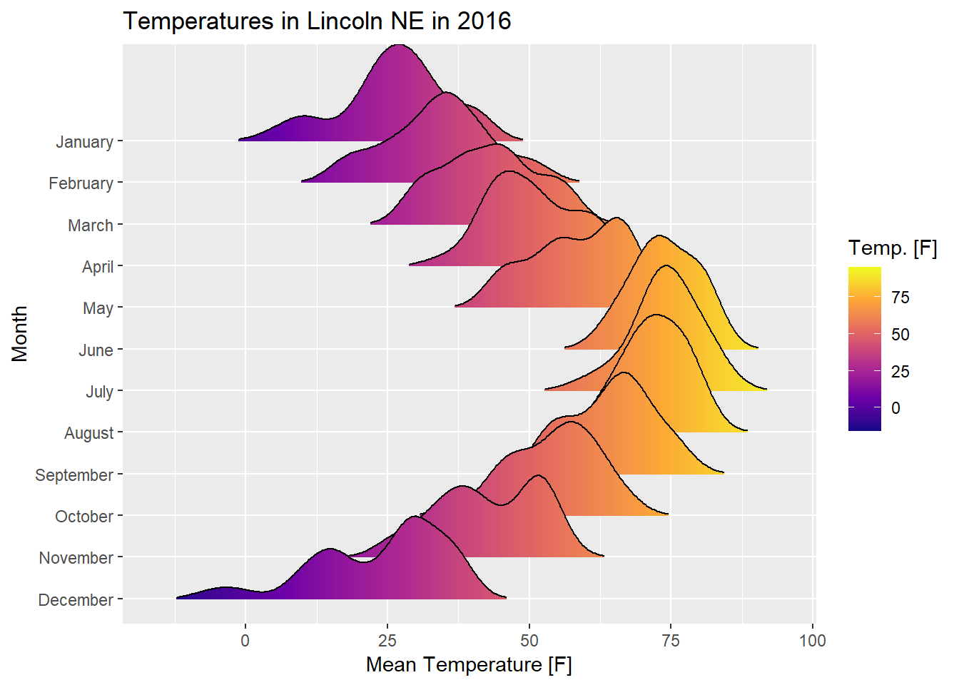
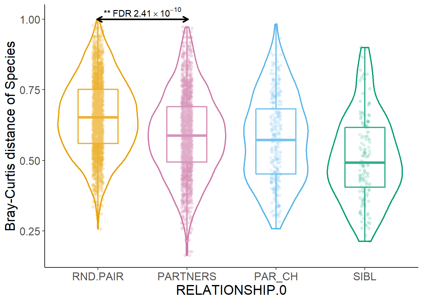
最后是今天的实际例子,这个例子的代码来源于一篇Nature的论文
Environmental factors shaping the gut microbiome in a Dutch population
dfToPlot<-read.csv("example_data/05-boxplot/dfToPlot.csv")
head(dfToPlot)
## BC_Spec BC_PWY BC_VF BC_CARD RELATIONSHIP.0 COHAB
## 1 0.5018598 0.1521802 0.8009368 0.7540197 RND.PAIR FALSE
## 2 0.6017878 0.1199416 0.9098667 0.6745180 RND.PAIR FALSE
## 3 0.6943654 0.1322052 0.8794888 0.4336659 PARTNERS TRUE
## 4 0.5504249 0.1195811 0.5355828 0.7883583 RND.PAIR FALSE
## 5 0.8220028 0.3994575 0.8408817 0.9276368 PAR_CH TRUE
## 6 0.7683990 0.3743061 0.9730157 0.9912979 RND.PAIR FALSEtable(dfToPlot$RELATIONSHIP.0)##
## PAR_CH PARTNERS RND.PAIR SIBL
## 285 1758 2000 144dfToPlot$RELATIONSHIP.0 <- factor(dfToPlot$RELATIONSHIP.0,
levels=c("RND.PAIR","PARTNERS","PAR_CH","SIBL"))
cbPalette <- c("#E69F00", "#CC79A7", "#56B4E9", "#009E73", "#CC79A7", "#F0E442", "#999999","#0072B2","#D55E00")
ggplot(data=dfToPlot,aes(x=RELATIONSHIP.0,
y=BC_Spec,
color=RELATIONSHIP.0))+
geom_jitter(alpha=0.2,
position=position_jitterdodge(jitter.width = 0.35,
jitter.height = 0,
dodge.width = 0.8))+
geom_boxplot(alpha=0.2,width=0.45,
position=position_dodge(width=0.8),
size=0.75,outlier.colour = NA)+
geom_violin(alpha=0.2,width=0.9,
position=position_dodge(width=0.8),
size=0.75)+
scale_color_manual(values = cbPalette)+
theme_classic() +
theme(legend.position="none") +
theme(text = element_text(size=16)) +
#ylim(0.0,1.3)+
ylab("Bray-Curtis distance of Species")+
#scale_x_discrete(labels=c("A","B","C","D"))+
annotate("segment", x = 1-0.01, y = 1, xend = 2.01,lineend = "round",
yend = 1,size=1,colour="black",arrow = arrow(length = unit(0.02, "npc")))+
annotate("segment", x = 2.01, y = 1, xend = 0.99,lineend = "round",
yend = 1,size=1,colour="black",arrow = arrow(length = unit(0.02, "npc")))+
annotate("text", x=1.5,y=1.01,
label=expression("**"~"FDR"~2.41%*%10^-10),vjust=0) -> p4
p4## Warning in is.na(x): is.na() applied to non-(list or vector) of type 'expression'